
“What to call it?”
Black, White, and Red
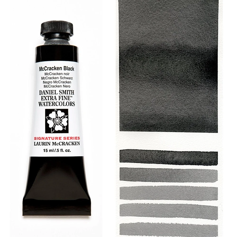
You’re famous for your deep, velvety black backgrounds. A twenty minute video exists of you mixing different Daniel Smith watercolors to create just the right black to suit your needs.
https://www.youtube.com/watch?v=Ztc6Xjmsccc
A few years after making that video, you partnered with the people at Daniel Smith to create “McCracken Black.” What was that experience like?
Oh, that was such a fun thing. Well, it evolved from a telephone call I got from [DS owner and CEO] John Cogley, and he's such a nice guy. He’s the calmest person I've ever met. And he called me and said, “Laurin, I just read somewhere that you mix your black. We make five blacks, and one of them might work.” I said, “Well, John, most blacks are made from dyes where the base is purple. What I found was that if I'm painting a silver picture, when I feather out that gray, it turns purple, and silver is not purple. I also found that your blacks are too opaque for me. I want to be able to layer things up.” I told him that I was using eight or nine different DS colors to mix a black that worked for me.
About a month later, he called me and said, “I've been thinking about our conversation about black. How would you like to work with my two scientists? Let's develop a black that meets your criteria.” And you know, I'm levitating off the floor. So for the next four or five months, those guys went to work. They would bring out some paints, add more colors, or take other colors away. About every other week, they'd send me a little jar of it, I'd test it and tell them what I thought about it, and they'd change it. And it was so much fun.
It’s almost like you were developing a perfume.
Exactly, exactly. And these guys are such experts, and they're nice people. It was such a pleasure. And finally, I approved their black. Later on they were in a marketing meeting. What to call it? So they phoned me and said they had narrowed it down to Laurin Black or McCracken Black. Did I like either one of those, and which one did I prefer? So I immediately said I liked the sound of McCracken Black. And that was the one they liked, too. Since then, they’ve told me a couple of times that it's one of the largest selling colors in the Dan Smith line internationally.
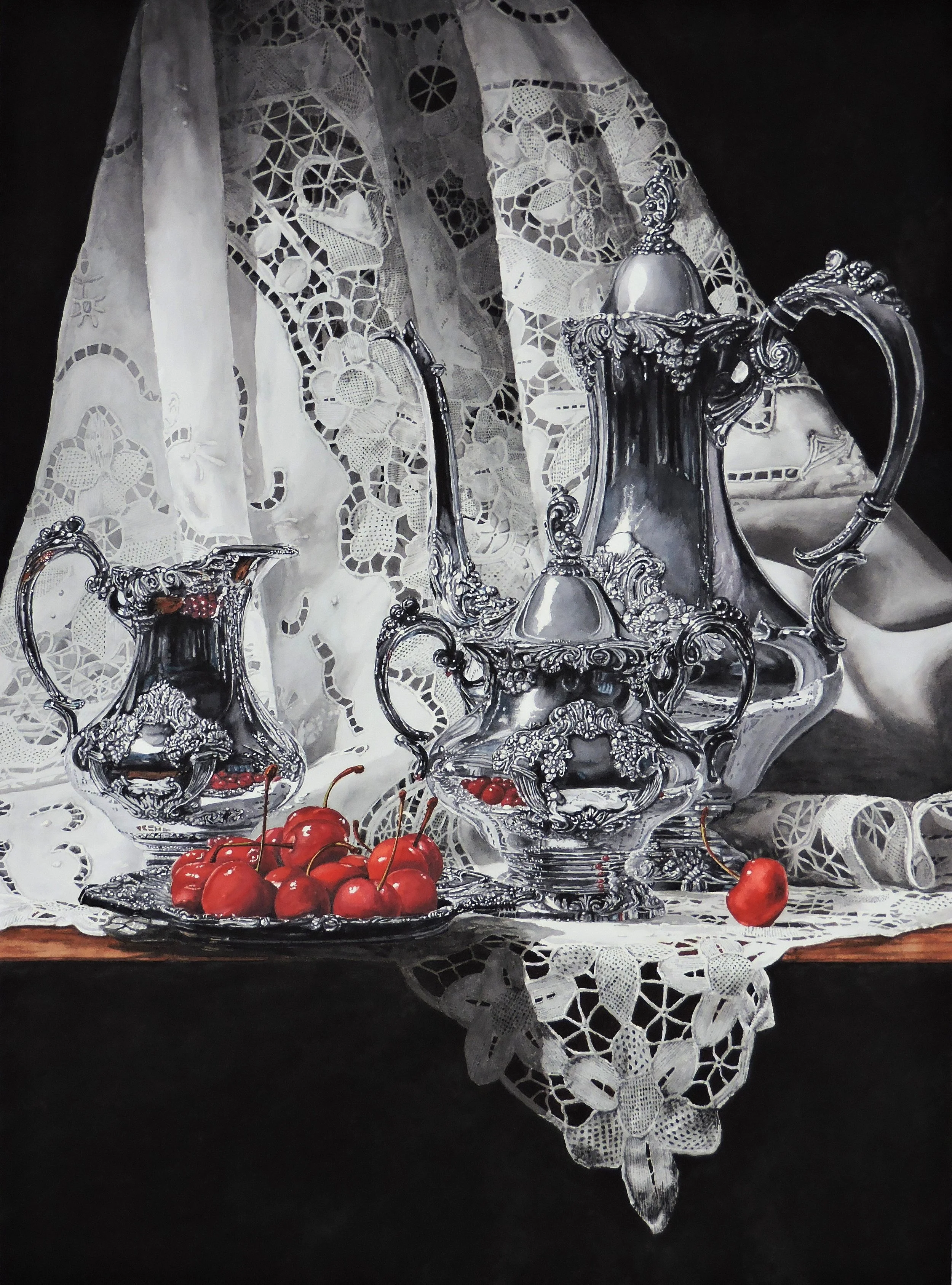
I was fascinated to learn that your black backgrounds begin with a colorful underpainting that echoes a color featured elsewhere in the picture. It’s often difficult to perceive this when your work is printed in magazines or shown in small reproductions online. In those formats, your backgrounds look like the darkest blacks imaginable. Can viewers pick up on your underpainting colors when they view your watercolors in real life?
Even the finest papers in the world, which I think are Fabriano Artistico, have spots where, after they’re run through that great big twenty-ton machine, the sizing doesn’t catch. In one of those small indentions, even in soft press paper, there's going to be a granule of sizing that didn't completely dissolve and is caught in the paper. Early on, when I painted my black backgrounds, I'd see white pin holes. So how do you find and correct those pinholes before you paint an area black? Because it's very difficult to correct them later. So my solution was to put a quick wash of whatever I had in excess on my palette, and that helped me find the pinholes. If it was just a little well, I’d fill it with the tip of my brush. And if it was a case of a little too much sizing, I’d wiggle the tip of my brush and dissolve it. No big deal.
Then I found out that the blacks I painted over those pinhole-finding layers were sort of translucent. When I held the painting up, I could not necessarily see, but I could feel the underpainting through the black. I experimented with that. With a silver still life, I used a phthalo blue as that underpainting. And when I put black on top of it, the silver looked more metallic. But if I had a flower or two that I wanted to enrich in a field of glass and silver, and the underpainting was an Aussie red, those flowers would just glow. And you can walk into a show of my paintings and never see that, but you can feel it, and when I point it out to you, you say, “Aha!”
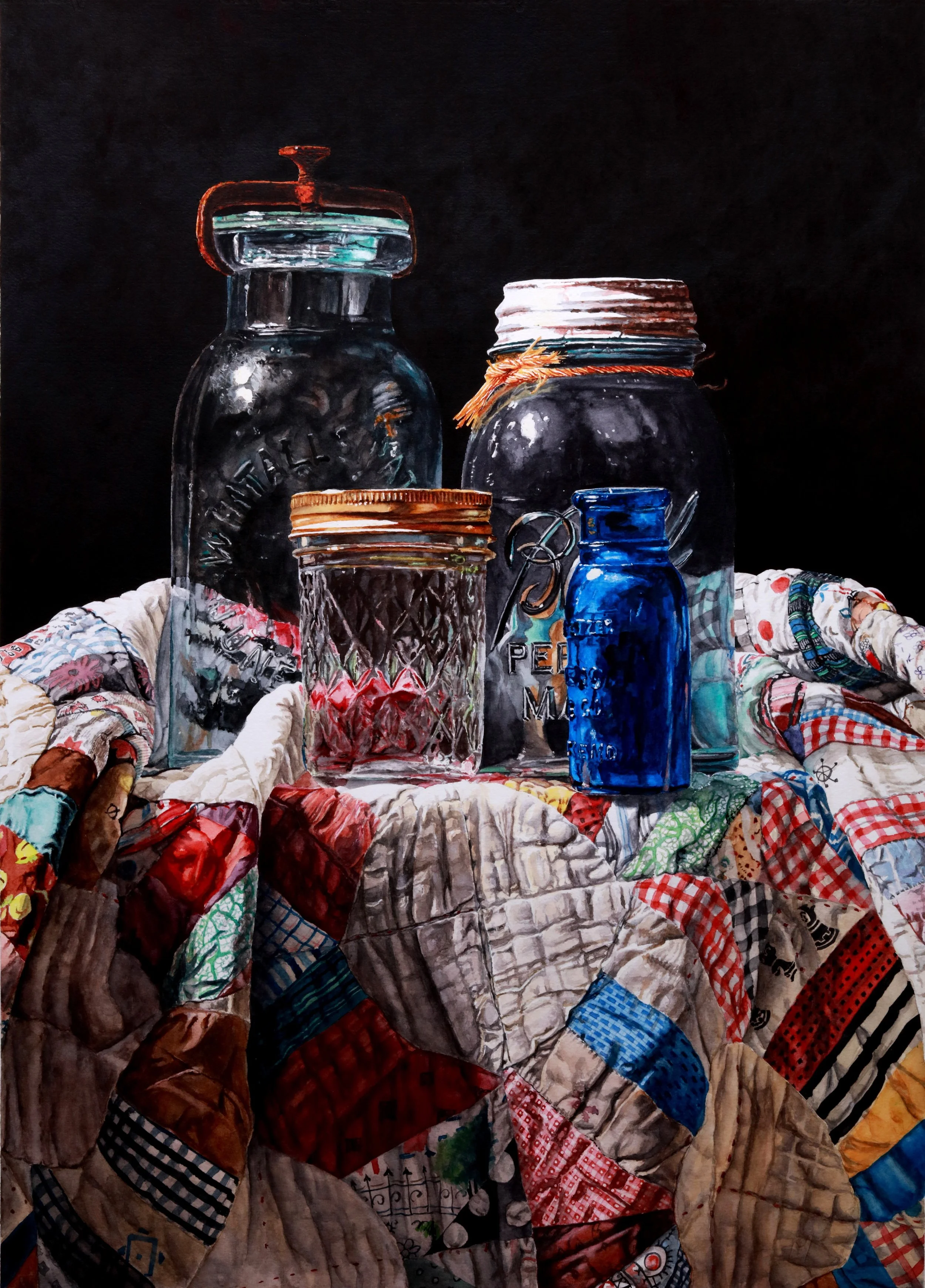
Jars on a Quilt
So many of us struggle to create flat, streak-free, dark backgrounds. Could you please explain your scumbling technique? Because when I watched you do this in the aforementioned video, your solution seemed positively revolutionary.
Scumbling helps you create a texture like velvet, and nobody's ever heard of scumbling. It’s a drawing technique from my architecture days. You use it to make gray backgrounds by moving the pencil in different directions every time you put it down on the paper. When people try to create a smooth gray background, most of them move the pencil in a single direction, but you can still see their pencil marks. And so what I’m trying to do with scumbling when I paint is to recreate that velvety texture where nothing lines up in the direction of the light. You know, it's tedious. It takes a lot of time. You have to be really patient, but it actually makes it easier to see the underpainting behind the black.
What size of brush do you use with your scumbling technique?
I use an old #10 round Kalinsky. Yet people try to do it with a hog brush or a stiff synthetic. No, you want a really soft brush.
Does this technique result in backgrounds that are considered transparent by a certain watercolor society whose annual exhibitions are held in Kenosha, Wisconsin?
Yes. I pretty consistently have had paintings that were good enough to be accepted for that show. Many times.